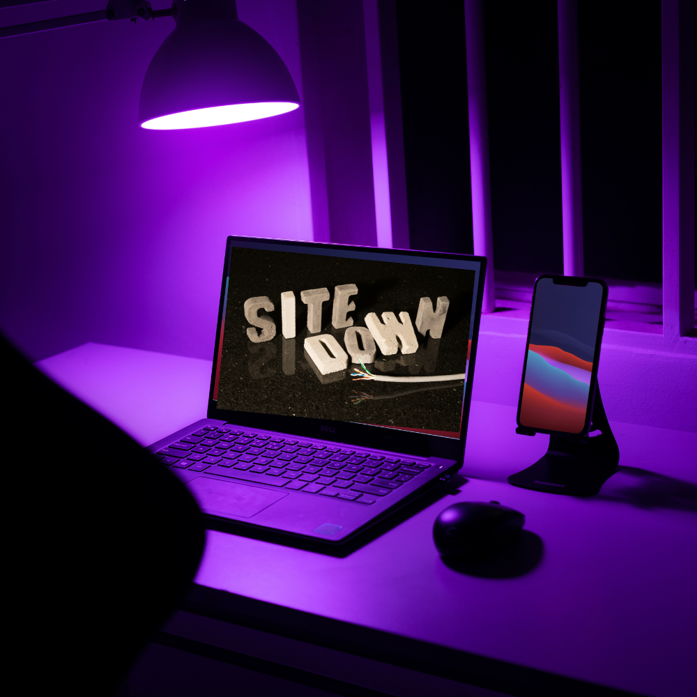

The website looked perfectly fine during the build. The layout felt balanced, the text was readable, and everything sat exactly where it was supposed to. It was reviewed, adjusted, and approved on a laptop screen where everything appeared perfectly.
Then you opened it on your phone.
Suddenly, the experience shifts, though nothing is technically broken. This is when you recognize a crucial takeaway: reviewing only the laptop view can hide critical differences in user experience on mobile devices.
The Screen Changed, So Did The Rules
The biggest difference between a laptop and a phone isn’t just size; it’s how information is experienced. Laptops let you scan across a page and view multiple sections at once.
A phone transforms the experience entirely.
Everything becomes vertical and information appears one section at a time. People scroll instead of scanning, experiencing the site in pieces, which changes how the site feels.
What looked smooth and controlled on a laptop can feel a little chaotic on the phone.
Responsive Does Not Mean Comfortable
Most modern websites are built using something called responsive design. Responsive design means the layout automatically adjusts to fit different screen sizes. Images shrink, columns rearrange, and navigation adapts so the site works on phones, tablets, and desktops.
That’s the baseline.
But “working” and “feeling good” are not the same thing.
Mobile Visitors Move Fast
People browsing on their phones are usually on the move, standing somewhere, or multitasking. They are not settling in for a deep reading session, which affects how they move through a website.
They scroll quickly, pause briefly, and decide if something is worth their time. If the structure is unclear or the page feels like work, they leave.
Quietly. Efficiently. Very ninja-like, actually.

Navigation Disappears
On a laptop, navigation is typically visible across the top of the page. Every option is right there. Easy to see and click.
On a phone, that dynamic changes.
Navigation collapses into a small icon. Visitors have to tap it to see their options. Though a small shift, it changes behavior—the visitor must now choose to look for navigation.
That means the page itself has to carry more weight. It needs to make sense on its own, guiding without relying entirely on a visible menu.
Speed Feels Different On A Phone
Page speed matters everywhere, but it becomes more noticeable on mobile devices. Large images, heavy layouts, and unnecessary extras can slow things down.
On a laptop, you might not notice, but on a phone, you will.
This is where hosting and optimization come in. A well-configured setup helps pages load smoothly across different devices and connection types. When a site loads quickly on a phone, it feels solid. When it doesn’t, people rarely stick around.
AI Helps, But It Still Needs A Human Eye
Artificial intelligence has made it much easier to build and organize websites. It can help generate layouts, structure content, and speed up decision-making that used to take much longer. That’s a good thing.
But AI does not experience websites as people do. It doesn’t scroll, feel when something is off, or notice if a button is too small.
AI can build the structure quickly. Making sure it actually feels right is still a human job.
What “Working” Really Means
A website that works today does more than load and display information. It adapts, it holds together across different environments, and supports how people actually browse.
The laptop version is the foundation because it gives you the full picture.
However, the phone is where most people find your site. If that experience feels off, they won’t spend time figuring it out.
They’ll move on… quietly, and without leaving a trace.
The good news is that this is very fixable. Most websites simply need a bit of attention in the right places to bring everything back into alignment. The flow makes more sense, the pages feel easier to move through, and visitors naturally stay a little longer and engage a little more.
And just like that, the same site that felt a little off on a phone starts working the way it was always meant to… smooth, steady, and quietly doing its job in the background, like a stealthy ninja.